Now a course at Harvard Online
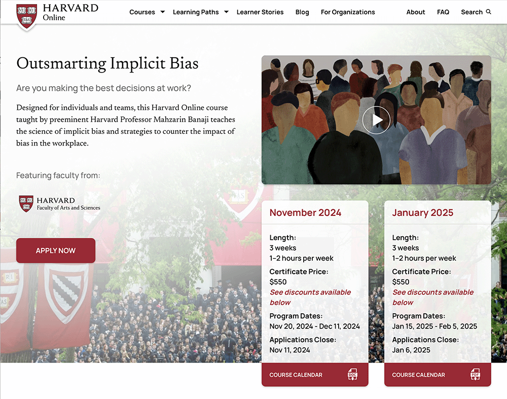
Outsmarting Implicit Bias is now a certificate-granting course offered through Harvard Online.
Visit the course page to learn more and enroll.
Questions? Contact us at oib@fas.harvard.edu.
Outsmarting Implicit Bias is now a certificate-granting course offered through Harvard Online.
Visit the course page to learn more and enroll.
Questions? Contact us at oib@fas.harvard.edu.